

In architecture, there is a series of core principles that, if followed correctly and incorporated with a reasonable level of skill, will result in a “good” (not necessarily inspired) design.
These principles are, to my knowledge, taught in every reputable school of architecture very early in their program and consistently referred to thereafter by competent educators.
Unfortunately, these core principles are neglected, ignored or improperly applied by far too many practicing architects and results in poor designs which, if constructed, assault the public’s senses with inferior built architecture.
Moreover, these fundamentally flawed buildings generally detract from the quality of the associated streetscape, neighbourhood and community. To use an analogy, they are like a giant wart on the nose of an otherwise attractive face – one can simply not look beyond the wart to appreciate the beauty of the face.
In very simplistic terms, let’s define eight of these core principles.
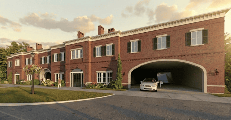
Consideration of “site” provides the framework within which a design will form a harmonious relationship to its setting, which includes, but is not limited to, the landscape, topography and surrounding built architecture.
In short, a good design will complement and add to its setting. Conversely, the design will fail if it dominates (or is incongruous) with the site rather than integrating within it.
“Order” is the underlying rationale of the design, which is couched in fundamental human predispositions that allow the building to be intuitively read by the average person.
For example, walls, openings and spaces need to be organized in a fashion that creates a natural flow that says, without words or thought, here is the approach, the entrance and the path to move toward and around the building.
The best designs have a level of order that intuitively communicates the location and purpose of everything in the building.
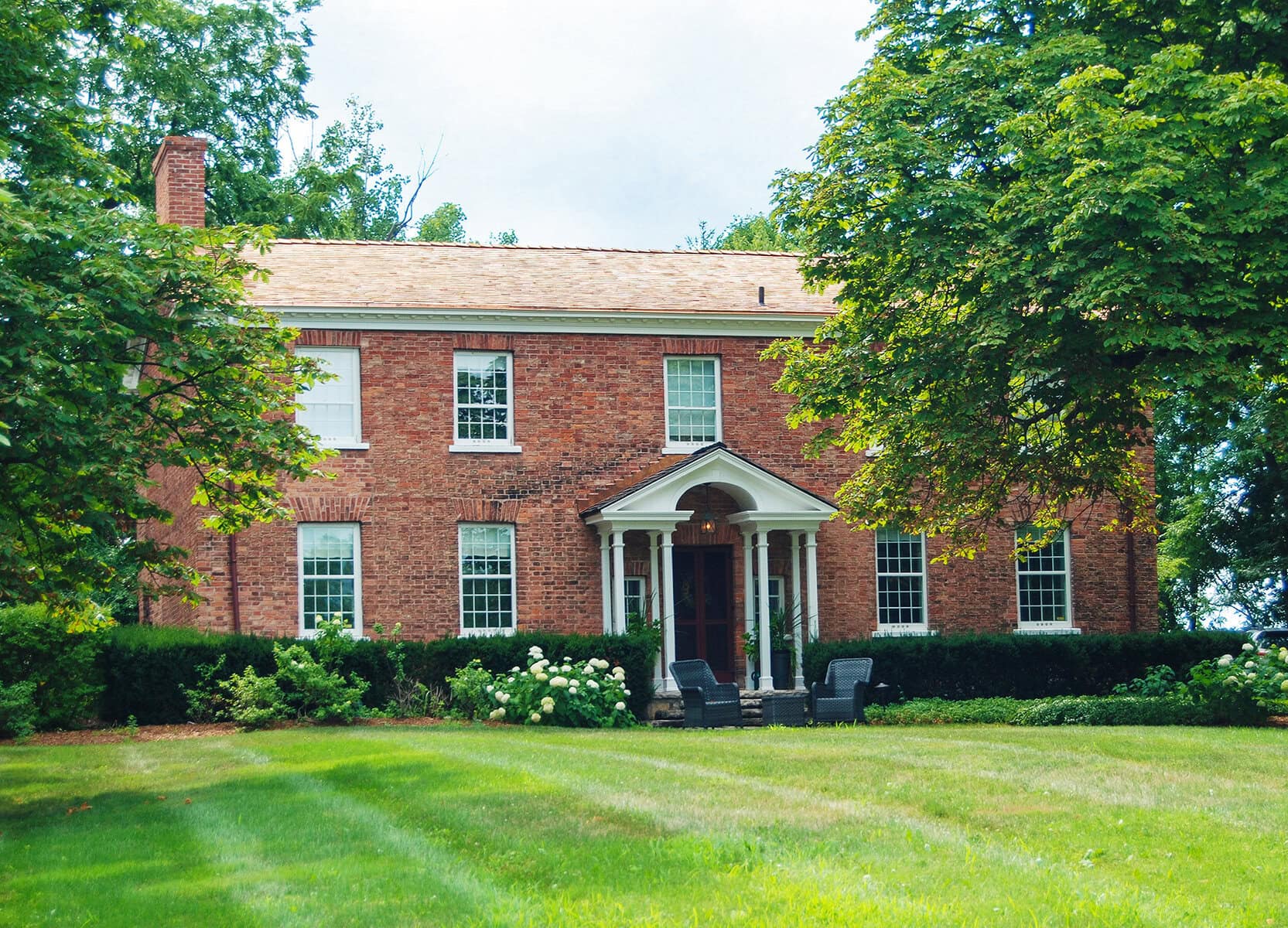
To achieve visual harmony and perceptual stability, the design must have “balance” — a building facade wherein the left half has exactly the same visual weight as the right half.
The simplest example is the classic Georgian symmetrical façade, with its main entry precisely centred with identical (size and shape) openings placed in the same positions on both right and left sides.
However, if the main entry is not centrally placed, the architect must correctly use mass, shape, colour, proportion, placement/location of elements, combinations of materials, etc., to create the visual impression that one side of the house balances the weight of the other side.
“Balance” complements and reinforces “order” to reach a design that is approachable, understandable, and most importantly, appears and feels harmonious.
Briefly, “hierarchy” is the selective use of secondary and tertiary elements in the design to establish a visual cascade which irresistibly draws your eye (focus) to the principal elements of the building; hence establishing a hierarchy from least to most important.
It is vital to ensure that every element used in the visual composition works in concert to create an intuitive understanding of the design by guiding your eyes, and subsequently your movement, toward natural flow points in the design.
Working in combination, the next two core principles, “scale” and “proportion,” play a vital role in establishing hierarchy while at the same time contributing to the invocation of a “comforting” emotional response when a building is experienced.
In architecture, scale refers to sizing elements according to a known standard — most frequently, the human form. So, by using scale, the designer can maintain consistency between the perceived size relationships of two specific elements: the elements to the whole and/or the entire composition to the viewer.
Proportion is a mathematical discipline developed in ancient times to calculate/design the various elements of a building composition to establish a consistent set of visual relationships between the building’s individual components, the components to the whole, and the whole to its context.
Aesthetically complete compositions require that the designer achieve a perceived equality (or ratio) between all elements in the design.
To illustrate this, let’s consider the columns on a front porch. If the columns are out of scale or inaccurately proportioned, your eye will focus on the columns, resulting in the overall pattern of the facade being diminished, or worse, it will disrupt that pattern and evoke a subconscious rejection of the architecture.
Carefully applied in concert with the other principles we have addressed, “rhythm” and “pattern” speak to the natural human attraction for order.
Rhythm can be defined as the regular occurrence of similar and/or identical elements to produce a sense of predictability, movement and sequence across the visual composition.
Pattern is the introduction of surface elements, generally decorative, which visually provide both variety and unity.
Here’s the key: items set in cadence create a sense of rhythm and “rhythm repeated” forms a pattern.
For very fundamental reasons, history has shown us that the human psyche is both attracted to and secure with order in architecture.
Conversely, chaotic or disruptive built architecture can undermine both individual and communal security.
Our built environment can and should be a stable, secure platform that supports creative innovation. Bluntly, it’s nearly impossible to launch a spaceship to Mars on the ocean’s waves.
To be clear, both traditional and modern architectural expressions can be “good” design — provided the core principles of architecture are adhered to.
Next week, we’ll consider these principles in the context of actual proposed designs in our small town.
Brian Marshall is a NOTL realtor, author and expert consultant on architectural design, restoration and heritage.