
I'm the first one to admit I’m OCD about realizing the finest expression of a heritage building which, typically, is how it would have appeared when first completed.
I think the goal of any designer is to create a completed presentation in which the “whole is greater than the sum of its parts.”
To accomplish this, each individual component of the composition must be weighed and considered for its additive effect on the whole. Further, for the architect working in one of the established architectural styles, this endeavour must conform to defined stylistic parameters.
Let’s illustrate this using our project at 240 Centre St. a raised two-storey cubic form Regency building with a pyramid hip roof.
The designer needed to create a “canvas” that was as close to mathematically perfect as possible; scale, proportion, balance, and so on, had to be precise and correct because one couldn’t hide a mistake with ornamentation.
The next step was to establish horizontal integration, which, in this case, was accomplished through the introduction of a limestone watertable, a second-floor belt course and the eave overhang.
To embellish this canvas, in accordance with Regency minimalist parameters, the designer was limited to the treatment of lintels, sills, windows and door openings, the front stairway, eaves and shutters.
Our designer introduced heavy limestone sills and lintels, which not only contributed to the horizontal lines of the house but also drew attention to the openings.
The eaves were given a light entablature set with delicate C-brackets. The muntin bars in the windows were as slender as possible to maximize the decorative impression created by the wavy glass and the openings framed with a single-dowel moulding.
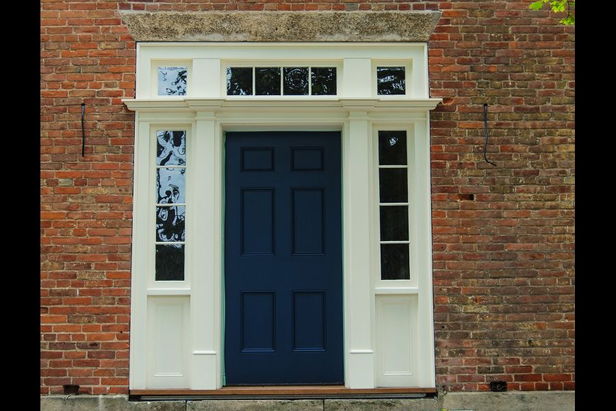
The front door surround was an elegantly simplified neo-classical form featuring more wavy glass. The flared front stairway narrowed in to bracket the front entry statement while the first-floor panelled shutters echoed the door itself.
Then came colour to consolidate the presentation. In this period, a two-colour scheme was typical, with door and shutters in a deep, rich colour to contrast with all other painted surfaces. On a high-status house in early 19th-century NOTL that would very often be a white with soft buttery undertones set against the richness of Prussian blue.
Unfortunately, as decades passed, both true heritage white and correct Prussian blue have become commercially unavailable.
To me, today’s sterile titanium white and its variants would not bring together the original presentation nor would any modern blue paint have the depth of colour. Luckily, we have an expert colourist (Sarah Cymba of Creek Road Paints) in town and she worked her magic.
After several trials, these historic colours have been recreated and work synergistically to produce the “finest expression” of the house.
It’s all in the details!