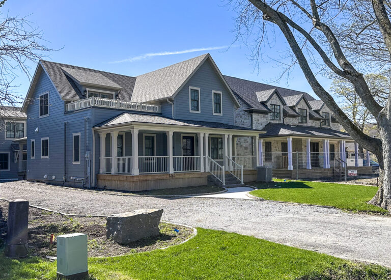
For some reason there is a commonly held opinion that the homes of our immigrant ancestors were boring and somewhat sombre places.
When asked to visualize the colours used in early 19th-century houses, most picture muted earthy tones that were perhaps complemented with white or dull green.
In fact, this impression could not be further from the truth. Colour, often vibrant colour, was used whenever and wherever it was available. In real terms, more than any other factor, cost of the limited number of pigments used to tint the paint, and the home’s architectural style, dictated the colour choices.
White paint was a staple. However, this was not the “white” we are used to today. Prior to the advent of titanium dioxide pigment in the early 1900s, white paint was compounded using white lead, chalk and/or lime mixed with linseed oil, a thinner and hardener. This produced a cream or off-white tonal quality that was often “warmer” than the brilliant white of today.
In Georgian homes at the turn of the 19th century, a range of grey and peach tones were accented with deep, rich colours such as burgundy, gold and, for the affluent, blue. Blue pigment being extremely rare and costly made the colour a statement of financial success.
As an interesting side-note, paint made with Prussian blue pigment would, under exposure to the sun coupled with yellowing imparted by aging linseed oil, gradually turn into the deep grey-hued green commonly associated with Niagara Georgians.
Early Regency homes drew on the Georgian palette, but by the end of the style’s first decade of popularity had shifted to both lighter and paler colours. Creams, sage greens, pumpkin hues, muted blues and stoney greys were common on exteriors, while the interior colours were brighter and complemented by pale trim in period whites.
On the exterior of Neo-classical (and subsequently Greek Revival) houses period white, off-white, gray or ochre paints were the colours of choice. They all were meant to emulate the natural stone used in Roman and Greek temples and if a contrast paint was used it would typically be either dark green or black. Rich hues of gold and green were reserved for interior use.
This brings us to colours of the Gothic Revival and later styles, which we’ll look at in a future column.


.jpg)


