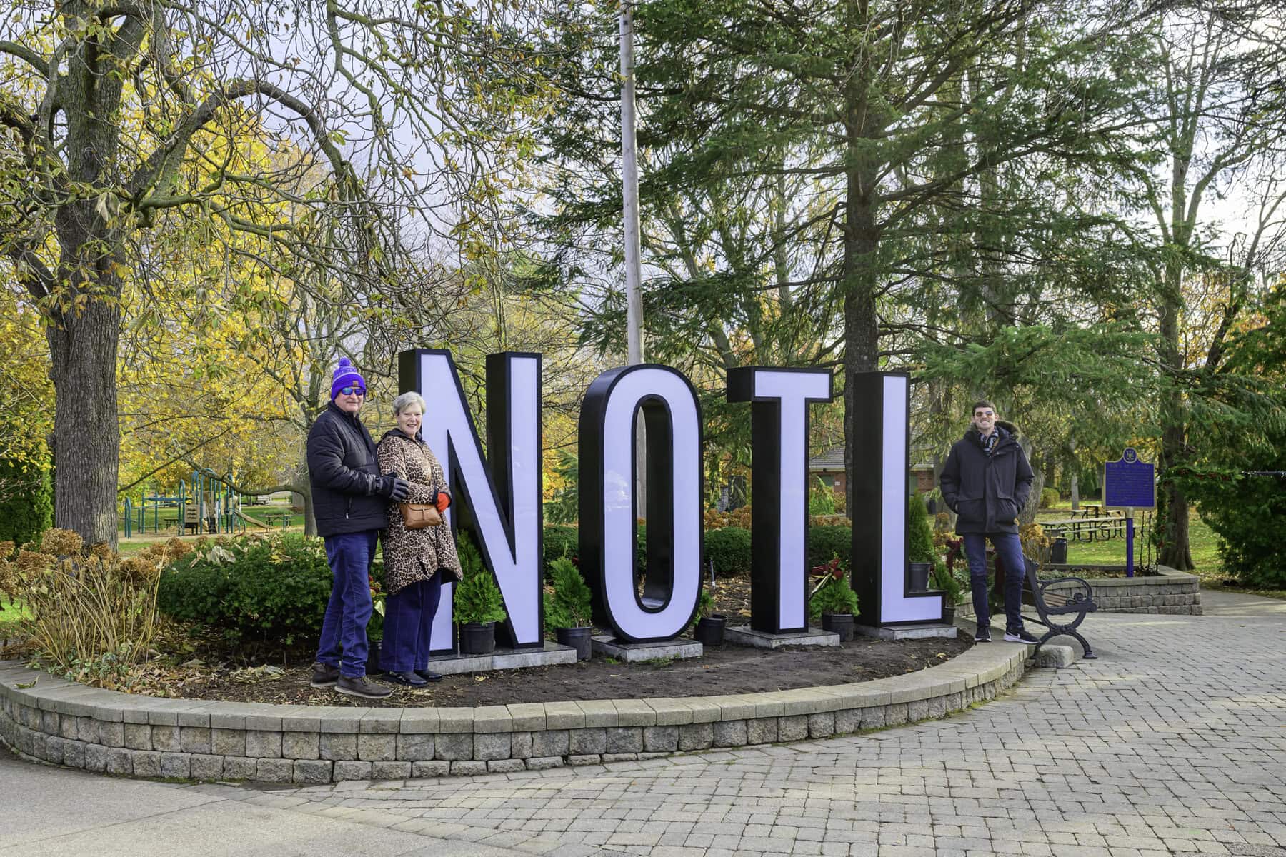

A new illuminated sign has appeared in Simcoe Park this holiday season.
The sign, which features the abbreviation “NOTL” in large block letters, was installed at the park entrance last Thursday, before being moved to further inside the park overnight on Tuesday.
Tourism NOTL is behind the installation. Kathy Weiss, its executive director, said that the sign is inspired by similar ones seen in other cities, like Toronto and Ottawa.
The goal, she said, is to brighten up the town and attract visitors during the holidays. It will be up only for the holiday season.
“We’re exploring ways to enhance downtown NOTL’s holiday decorations,” she said. “We thought this sign could be a fun tourist attraction and a great photo spot, especially for people wanting to take selfies.”
The sign cost $15,000 in total. Weiss said the sign was funded through the municipal accommodation tax, which comes from tourists staying in local hotels — not taxpayer dollars.
The sign was moved from its original spot at Simcoe Park to further inside the park “for the sake of safety and risk, as well as sightlines for drivers,” Weiss said.
Reactions to the sign have been mixed. While Weiss has received positive feedback, she acknowledged there are critics. Some voiced their opposition on social media, particularly on the NOTL 4 All Facebook group, while others supported the sign.
Katie Napolitano, manager at Sentinel Carriages, which offers horse-drawn carriage rides in Old Town, told The Lake Report that she believes the sign doesn’t fit with the area’s character.
“I feel it’s a little large and doesn’t really go with the town,” she said.
Members of the Facebook group shared similar sentiments. User Madi Coyle wrote, “This doesn’t complement Old Town in the slightest. We should urge the town to do better, even for something as small as a tourist photo spot.”
On the other hand, some people support the sign. User Keri Lynn-Lee commented, “I think it looks great. I love the new branding of NOTL. It’s a historic town with a modern edge.”
A few others expressed surprise at the strong opinions surrounding the sign. User Tim McEwan said, “Looks like something that shouldn’t bother you, that’s for sure.”
Weiss noted that the Chamber of Commerce has been working with town staff for the past two months to bring the sign to life, and it was approved by the town two weeks prior to installation.
The font, she said, was specifically chosen to match the town’s logo and is considered a “heritage font.”
Weiss said Tourism NOTL was charged $200 for installation, so she expects the relocation will cost the same.
daniel@niagaranow.com